
Saloni's guide to data visualization
Why data visualization matters, and how to make charts more effective, clear, transparent, and sometimes, beautiful.

Until a few years ago, I thought data visualization wasn’t very interesting. At best, it was a nice bonus in my work. I preferred writing because I found it gave me the space to get across the details and clarifications that people would often miss on a flashy chart.
Anyway, most data visualizations I had come across were not very good. A lot of graphs were (and still are) confusing, misleading, or overly simplistic. I’ve seen quite a lot – three dimensional bar charts, double-axis charts with completely different scales for the same metric, unitless charts, pizza slice charts with sizes that corresponded to nothing in the data. Even now I come across charts that are ugly in such novel ways that I wonder how much imagination it must have taken to create them.
But with time, I’ve increasingly understood the importance of good data visualization. A lot of credit goes to my colleagues at Our World in Data for inspiring me and giving me feedback during the four years I worked there. I spent time thinking more deeply about the value of charts, and when they worked better than a written description. In the end I came to the conclusion that there were several situations in which I would prefer a chart.
In this post, I want to give you a sense of why data visualization matters, and walk you through how to make it more effective, accurate, and beautiful.
This post is long and won’t fit in an email. As usual, I’ll pay you if you spot an error in this post, aside from minor typos or grammatical errors. Please let me know if you find one, so I can fix it.
Why visualize data?
Visuals can help explore data
First, for exploring data. Plotting data helps spot new patterns, trends, and unusual data points that can be hard to spot in a description, especially if those descriptions are about an average or a snapshot of the data, as they often are.
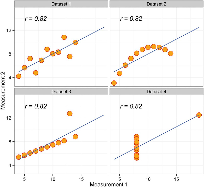
A classic example you’ll learn in statistics is ‘Anscombe’s quartet’: where the same correlation can result from vastly different underlying patterns in the data. It’s a reminder of how important it is to think about what’s in a correlation – I’d recommend this great blogpost by my friend Julia Rohrer on the topic.
Another example is from my work: this chart of the sex gap in life expectancy. Before I visualized the data, I hadn’t realized that the gap had changed so much over time, or why it had happened.
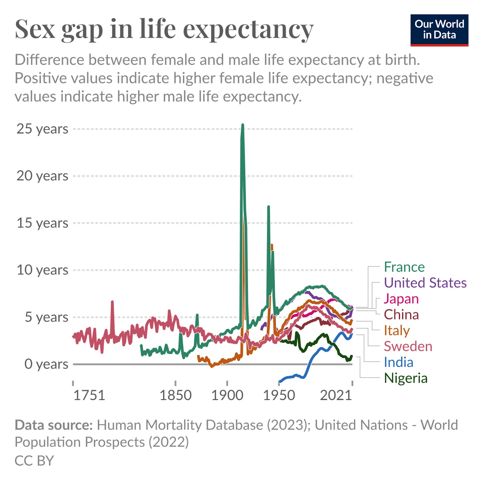
Visualizing the data made me notice two things. One was the massive impact of conflicts (e.g. the two world wars). Another was the widening gap over the twentieth century, and then its subsequent narrowing.
After reading much more on the topic, I learnt that the widening gap was driven by the rise of smoking, especially among men, which raised the risks of various cancers and heart disease and early mortality. I ended up writing a whole article about it – the causes of the sex gap in life expectancy and how it has changed over time and varies around the world.
Visuals can help explain concepts
Charts and diagrams are also valuable for explaining concepts. I often still prefer finding ways to write a clear written description that people can understand. But sometimes, visualization helps people absorb concepts better or faster, or helps them make new connections.
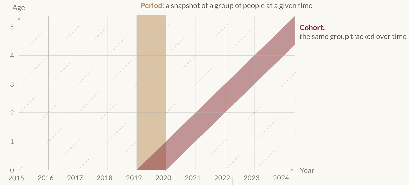
Take this diagram I made, of the difference between period and cohort data.
The visual is a few-second summary of what’s often a long and confused explanation for a concept that is really quite simple. A concise description – as I’ve given on the diagram itself – would help too, but the visual helps make the contrast much clearer.
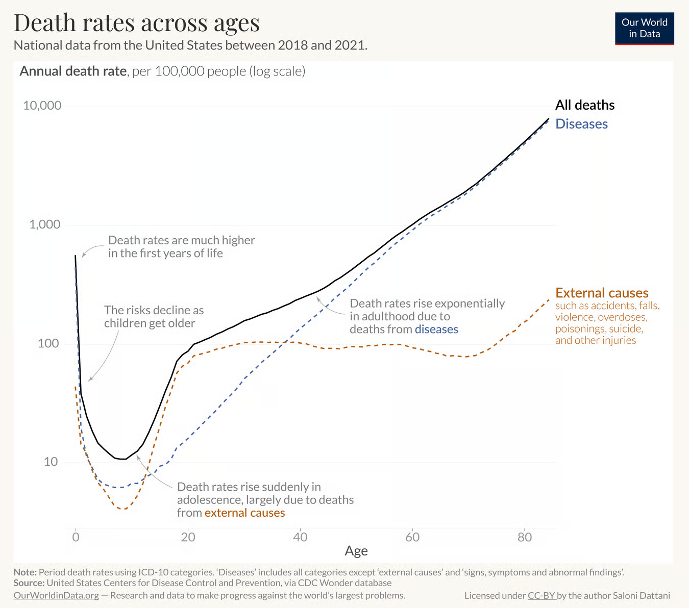
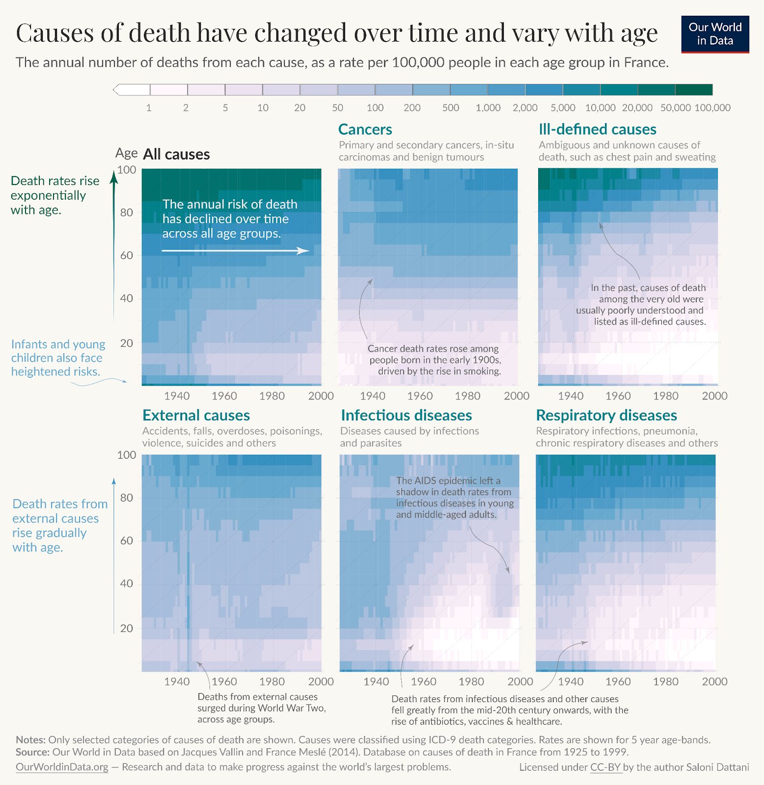
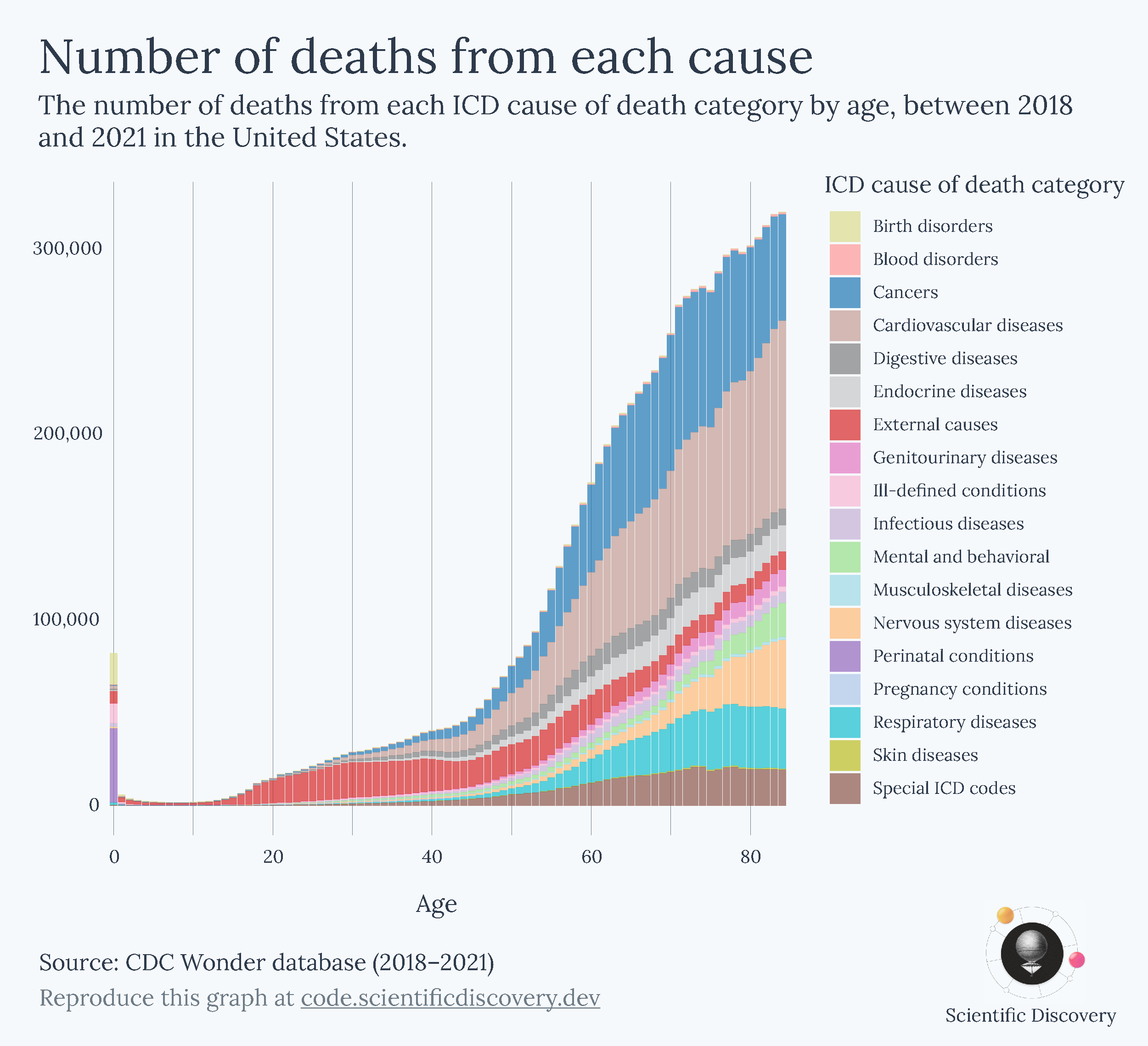
Below is another example. It shows death rates across ages. You can see the trend looks like a hook, which might be surprising. To explain why it has this shape, I’ve split the data into two components: the rates of dying from diseases vs the rates of dying from external causes (which include accidents, injuries, violence, and so on).
Now you can see why it is hook shaped. Risks decline steeply with age after infancy, rise suddenly in adolescence, and then rise gradually and exponentially after that.
This shape is often called the ‘Gompertz-Makeham law of mortality’, in which the risks from diseases generally reflect the Gompertz part (an age-dependent risk), while the external causes generally reflect the Makeham part of the law (an age-independent risk).
Visuals can help share information more effectively
Charts can also be much more effective for sharing information or a message. People say “a picture paints a thousand words” and perhaps it’s true – it’s far easier to read and reshare a chart someone has shared with you than it is to read & share a 1,000 word blogpost about the same topic.
Given my hatred of bad headlines though, I’d caution that you’ve got to use that power wisely. If a good chart can get a message across widely, so can a misleading chart. I think it’s quite common for people to want to become more widely read and less common for people to think about how to deal with the responsibility it comes with. Your ideas can mislead other people. It’s important to try to get things right and acknowledge your mistakes, especially when you have a larger audience. I think this goes especially for graphs, which are more easily distributed.
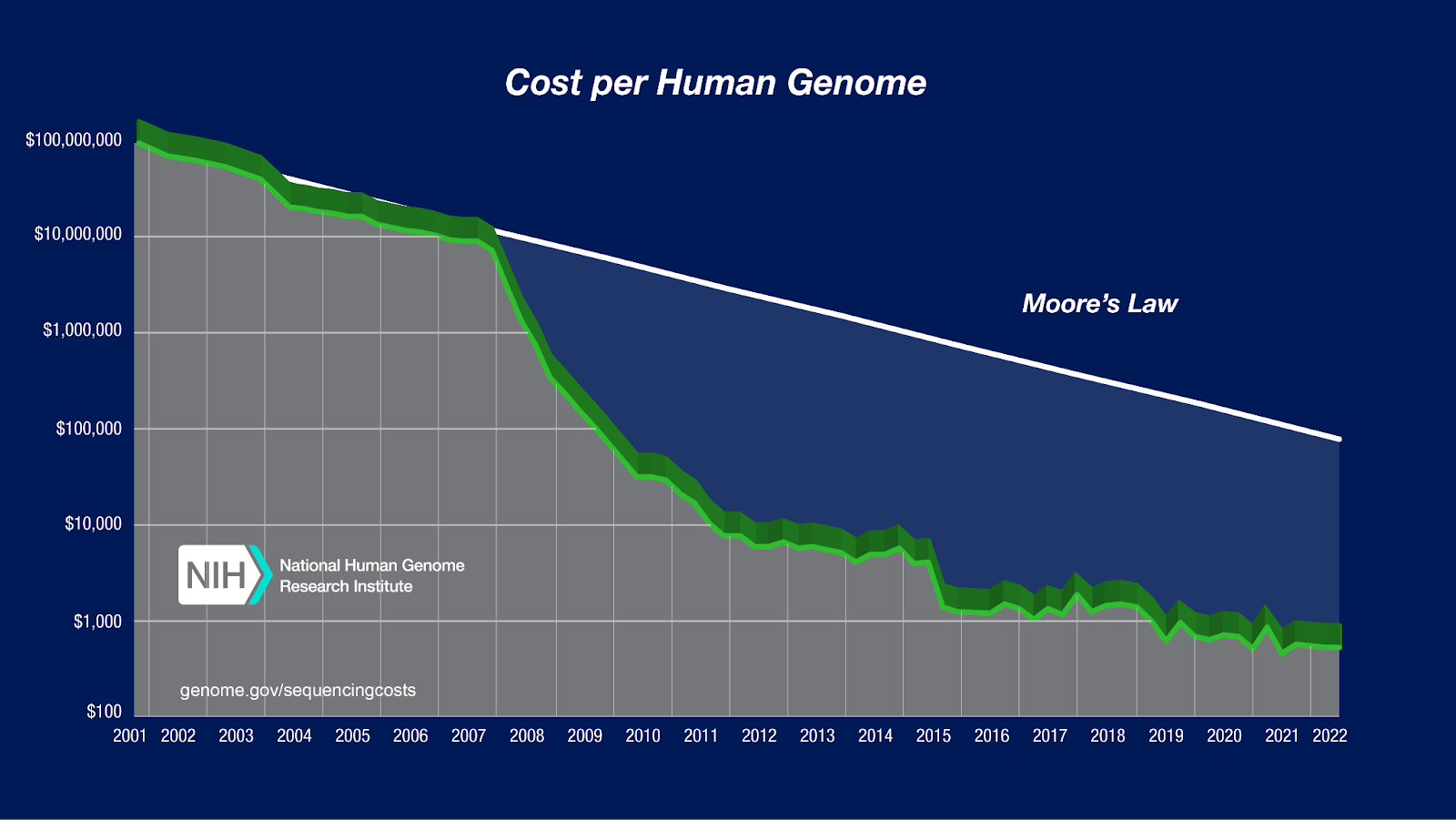
Caution aside, here are two of the most memorable charts I’ve seen. One is a chart showing the enormous decline in the cost of genome sequencing – a much faster decline than Moore’s law – which has enabled tons of biological research and diagnostics and some treatments too.
[I know the line is 3D and a lot of people hate that, but I don’t think it’s that bad when it’s a single line. It doesn’t make it hard to follow the trendline anyway, although if I was interested in specific data points I’d be a little confused about whether I should read off the values from the front or the back of the 3D object.]
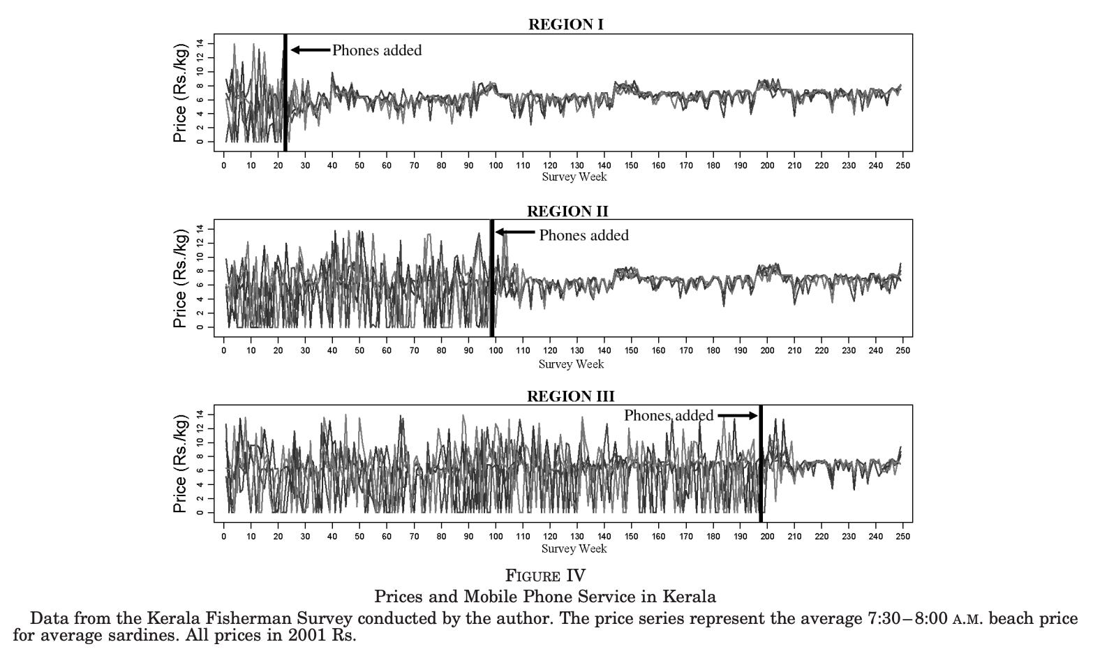
Another chart I find memorable is the one below, showing the adoption of mobile phones by fishermen in Kerala, and the impact that had on prices of fish.
Fish prices were very volatile before, but became much more stable as fishermen could share information much more easily. The idea is that, with phones, they no longer had to guess which harbour would offer the best price or risk arriving somewhere already oversupplied. Instead, they could call ahead, coordinate with buyers, and spread out across markets. Here is a link to the study it comes from, in case you are interested.
In essence, charts can be more memorable, shareable, and quickly-understood than a written explanation. They can also help you spot patterns to look into, as well as potential errors or artefacts.
Visuals can help spot patterns, potential errors, and artefacts
I had a stressful experience of this a few years ago, when I spotted an impossible result in a chart in the supplement of my PhD thesis, just a week before I planned to submit it. The impossible result was due to a coding error that affected some of the results in one of my thesis chapters as well. Thankfully, I figured out what went wrong and fixed it in time. Crisis averted, thanks to dataviz.
So I’ve hopefully now convinced you that charts are valuable. Another thing that I found quite persuasive was noticing that the difference between a good chart and a bad chart was often the difference between understanding a concept versus being extremely confused (or angry at it).
Take a look at this three-dimensional bar chart below, which is a real chart from an academic meta-analysis about the effect of compression garments on recovery from exercise. What information do you learn from looking at the chart?
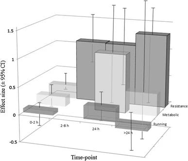
After you’ve finished being distracted by the totally unnecessary three-dimensional aspect of the graph, you’ll probably note that there is a large effect size on ‘resistance’. And something is happening to ‘metabolic’ at 24 hours.
Ultimately, the three dimensionality makes it harder to understand the graph and you probably wish it was all split up so you could see the data more clearly. So that’s what I’ve done below, roughly.
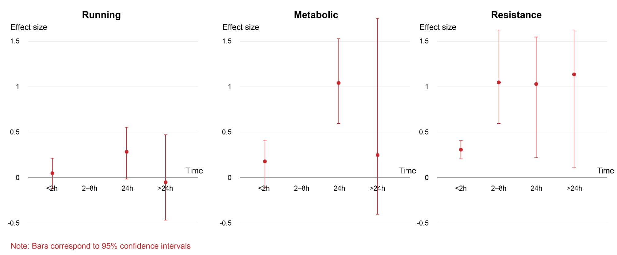
Aside from being able to read each set of results more easily, I’ve now also noticed the confidence intervals are really wide – there’s a lot of uncertainty in this data, which I didn’t notice in the original plot because I was quite distracted by navigating the 3D bars.
It also made me realize that the effect size didn’t have units that I could mention on the graph. After reading the paper, I found out they were ‘standardized mean differences’, which means the researchers took the difference between the two group averages and divided it by the standard deviation of the scores. In other words, they’re expressing how big an effect is relative to the typical variability in the data, so the number has no units, allowing many different effects to be compared on the same unit-less scale. Sounds confusing? You’re not alone. Many statisticians dislike this and similar metrics because it depends heavily on how spread out the data happen to be, which can change from study to study for reasons that have nothing to do with the underlying effect. The numbers can look bigger or smaller simply because the measurement was noisier or the sample was more or less varied, making comparisons across studies seem more like comparing apples to orangutans.
When possible, I prefer visualizing data in units that are already familiar to people or practically useful (like, a length of time measured in minutes instead of standard deviations from the average). Why? Familiar or practical units are easier to interpret and also easier to sense-check and potentially spot issues with. Although I know that they are not always possible, if visualization is meant for a broader audience, it’s valuable to try using them.
Now, you’re probably convinced that some charts are very bad, some charts are quite interesting, and finally, that improving a chart can help people understand the data better. But aside from splitting 3D bar charts into panels, how can you improve data visualizations?
Practical advice to improve data visualization
Here are some guiding questions I ask myself to help improve my charts. I’ll go through them below.
Is my chart type meaningful?
Can I make it clearer?
If my chart is too complicated, can I guide the viewer through it?
Does the chart work as a stand alone, as far as possible?
Is my chart’s presentation justifiable?
Is my chart reproducible?
A meaningful chart helps you answer a precise question
In the process of making new visualizations, I often start with a topic – such as the baby boom – or a statistic I’m interested in, like the number of children born per woman, and then look for datasets or metrics that I can visualize. But there are often many options: there’s the total fertility rate, the birth rate, and the age-specific fertility rate, just to mention a few. Getting familiar with what the metrics actually mean is crucial for presenting the data accurately.
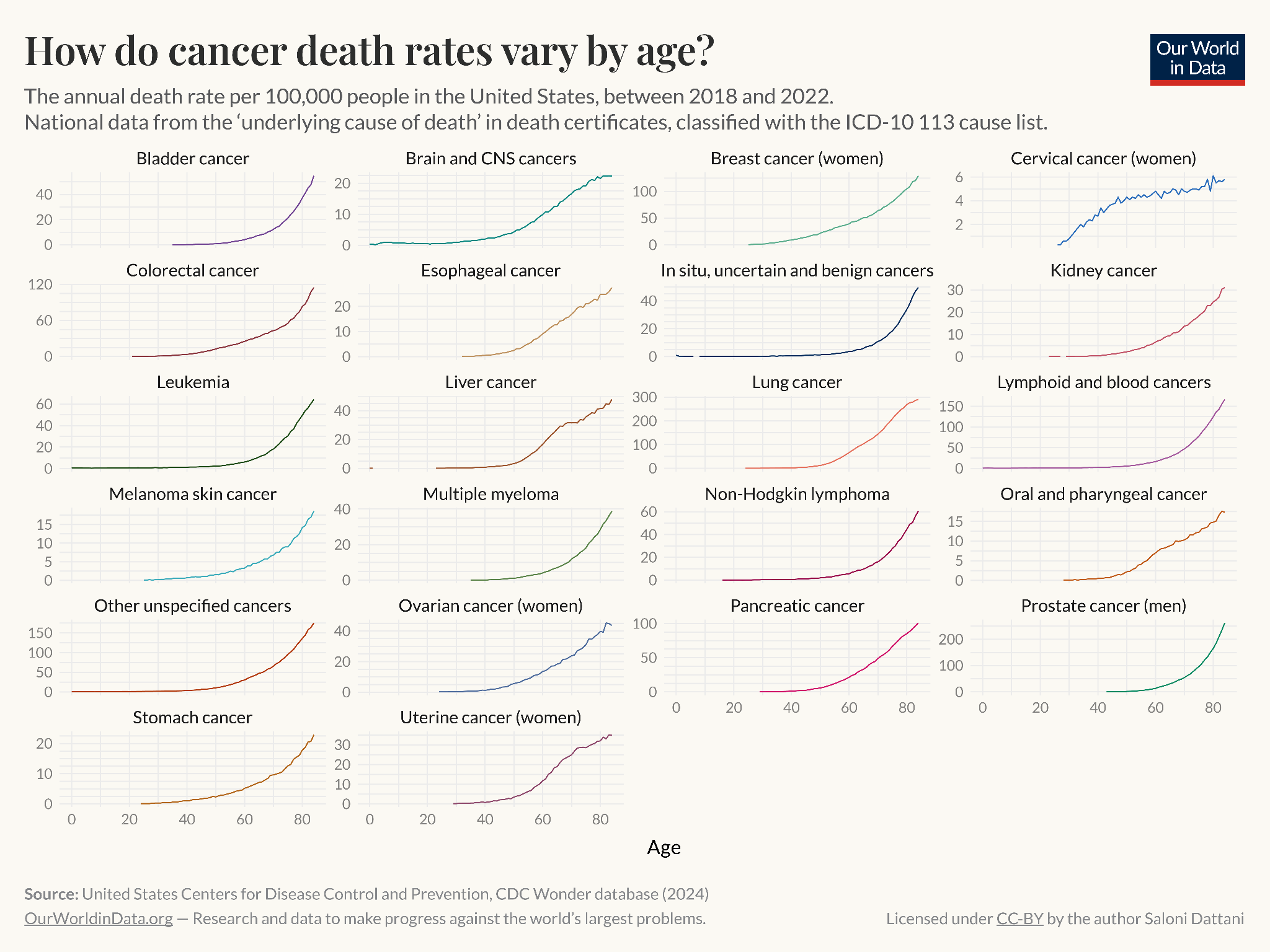
When I’m trying to choose, I ask myself what I’m actually trying to understand. What question am I trying to answer? I went through an example in much more detail in a previous blogpost, but to keep it short here, I started with a simple question: ‘How do causes of death vary with age?’
There were many ways to go about visualizing this. I could show the number of deaths from different causes across ages, the death rate from different causes across ages, or the relative share of deaths from different causes across ages, for example.
Here are each of them:
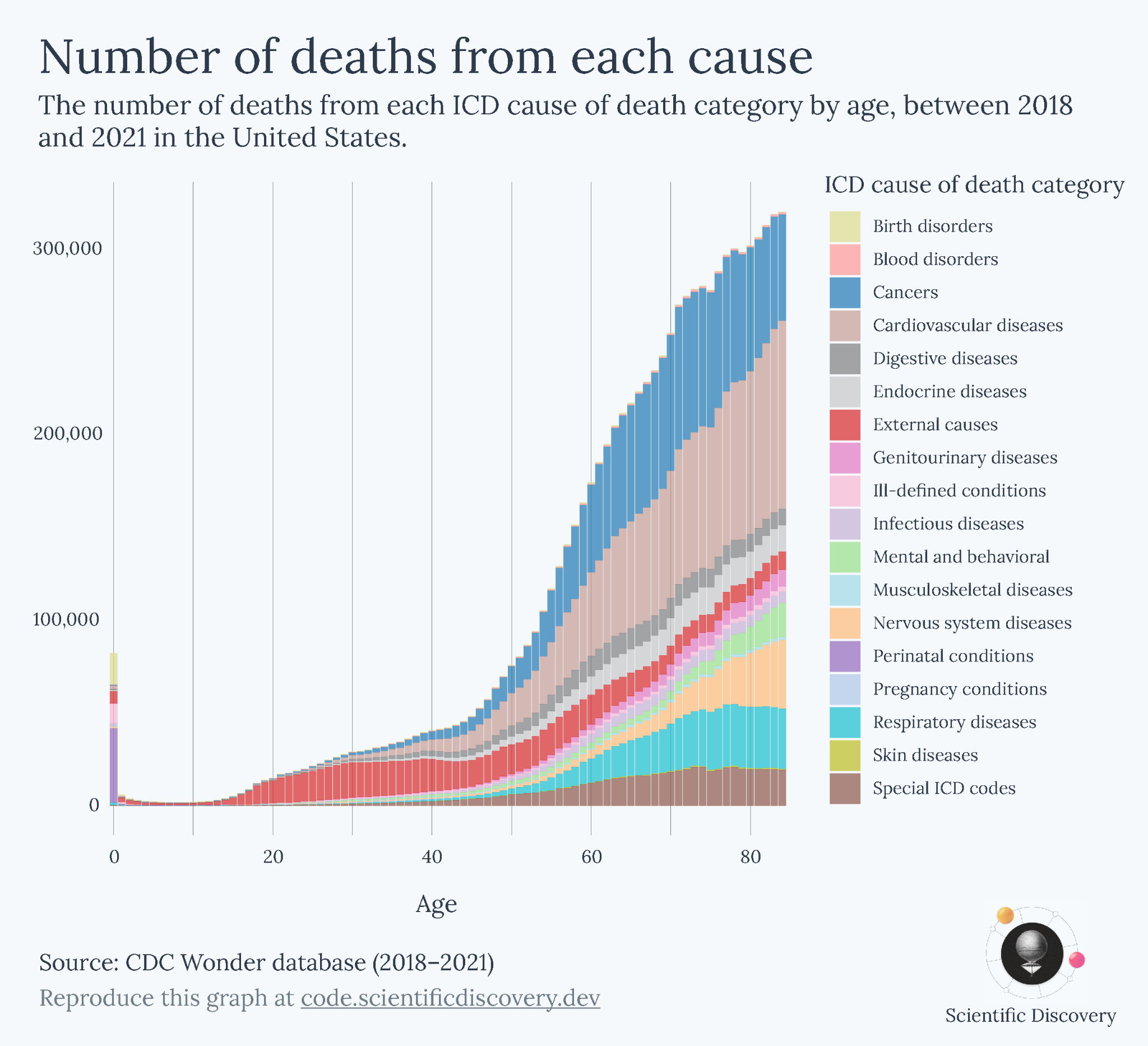
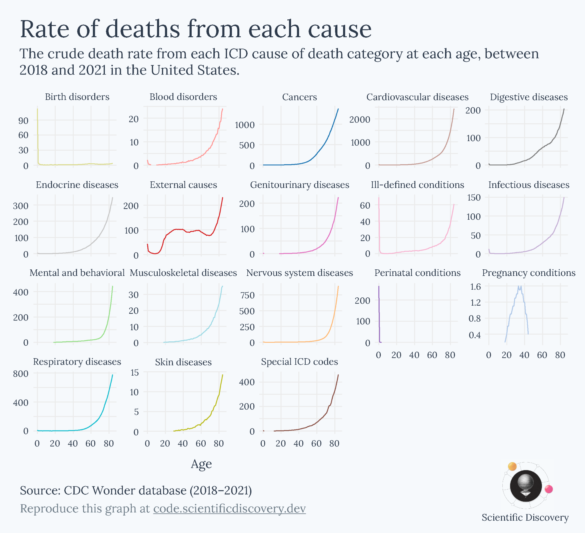
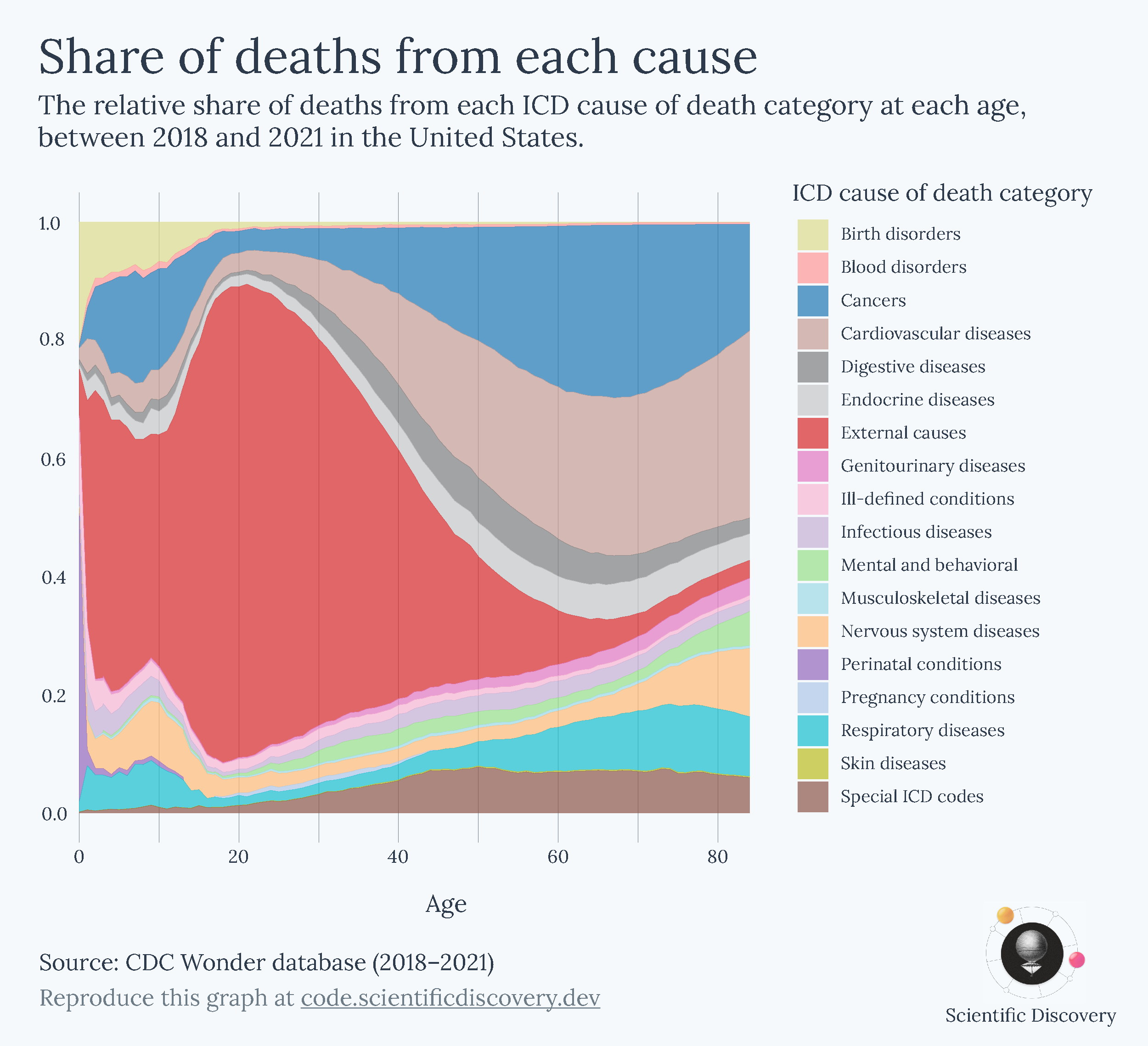
Each metric, however, gave me a different perspective of the data. It could be misleading if I took just one of them as the canonical answer to my question of how causes of death vary with age. Ultimately, that was because my question was too broad. After I looked back at each of the charts I made, I realized that they were helpful in answering narrower questions:
The relative share helped answer ‘What are people dying from at different ages?’
The absolute number showed me ‘How many people are dying from different causes at each age?’
The death rate showed me ‘What are the risks of dying from different causes at each age?’
By exploring them one by one, I had a better understanding of the overall topic and could describe and present each chart better. Here’s a whole article I wrote about those particular charts, in case you’re interested.
Clearer charts help you focus on the data itself
Ugly 3D charts are an example of how a lot of graphs are difficult to understand for no good reason. Charts are often convoluted or overwhelming in ways that slow down your understanding of the data. I’m not saying that you should make charts simpler, but rather that you should make them clearer.
In the graphic above, it’s much easier to focus on the content of the right-hand version – you probably finished reading that one first – while the left-hand version had a distracting font and might have made you tilt your head to read it. The right-hand version was much faster to read not because the information was simpler, but because it was clearer.
A key goal in data visualization, and in communication, is to help people spend less time trying to remember and understand, and more time actually following along, so they can explore and consider the implications of new information.
It’s hard to give advice for every type of chart, but below I’ll share some general pieces of advice that I think apply to many charts. They aren’t always possible or desirable to fulfill in every case. Consider them instead as recommendations that you might have to trade off with other concerns, some of which I’ll mention along the way.
Keep text horizontal
Unless you are living in Mongolia, Taiwan or Japan, you are probably used to reading text horizontally.1 Therefore, when possible, you should keep text horizontal – it’s the way people are used to reading. Compare the examples below.
Horizontal text might mean you need to shorten category names or using multiple lines, or use horizontal bars instead of vertical ones, for example.2
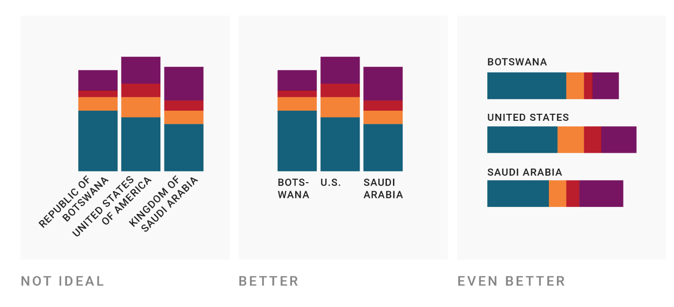
Label directly, unless you have too many/repeated categories
When charts have separate legends, you often have to spend time flitting your eyes between the legend and chart to see which category refers to which element of the chart. It’s time consuming and not always necessary, especially if the chart has only one instance of each category. Compare the two below as an example.
An exception is when your chart has a lot of categories, or categories that refer to many elements on the chart (as in the map below, where each constituency was won by a party). Directly labelling each one would obviously make the chart look very crowded.
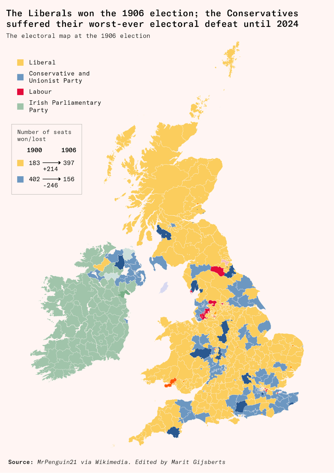
Here, you can also see an example of another piece of advice I’ll describe below: the colours are matched to the familiar colours of the political parties – yellow for Liberals, blue for Conservatives and red for Labour – which makes it easy to interpret the map even if you don’t look at the legend at all.
Split charts into panels to make individual trends visible
How about the chart below? It’s quite crowded, and there are so many colours that it’s difficult to identify the line for each state from the legend. In my view, the colours don’t add much – the graph would make the same point if the lines were all shown in grey and described simply as referring to different US states.
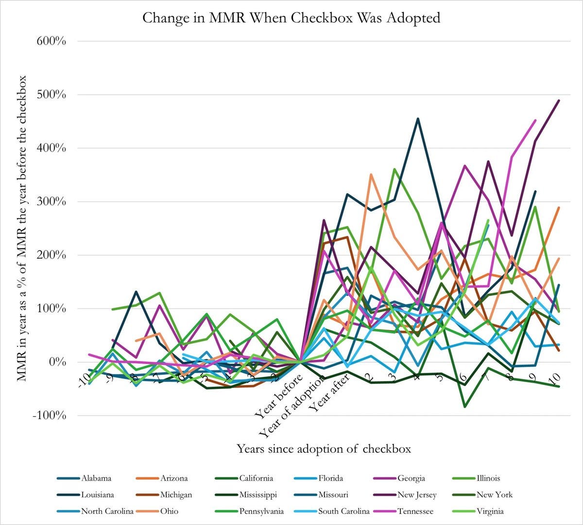
But when you have many categories on a chart, direct labelling could look crowded as well. And, in any case, it would be hard to follow each line since so many are overlapping.
A better alternative is to split up the data into multiple panels, like in the example below. This type of chart is often called a ‘small multiple’.
Above, all the panels have the same scale, but separating them into different panels makes the trends in each country much easier to follow.
On the other hand, my small multiple chart makes it harder to compare the trends between countries, since they’re now separated from each other. You can’t easily tell if one country has a higher value than another country at a particular time.
That’s a hint as to when to pick each version – if you want to make comparisons between entities, consider keeping them together and directly labelling them. If you want to let the reader follow the trend in each entity on its own, then split them up.
Show multiple perspectives of the same data when one isn’t sufficient
There are often times when you want to communicate multiple things about the same data. Not all of it has to fit on the same chart.
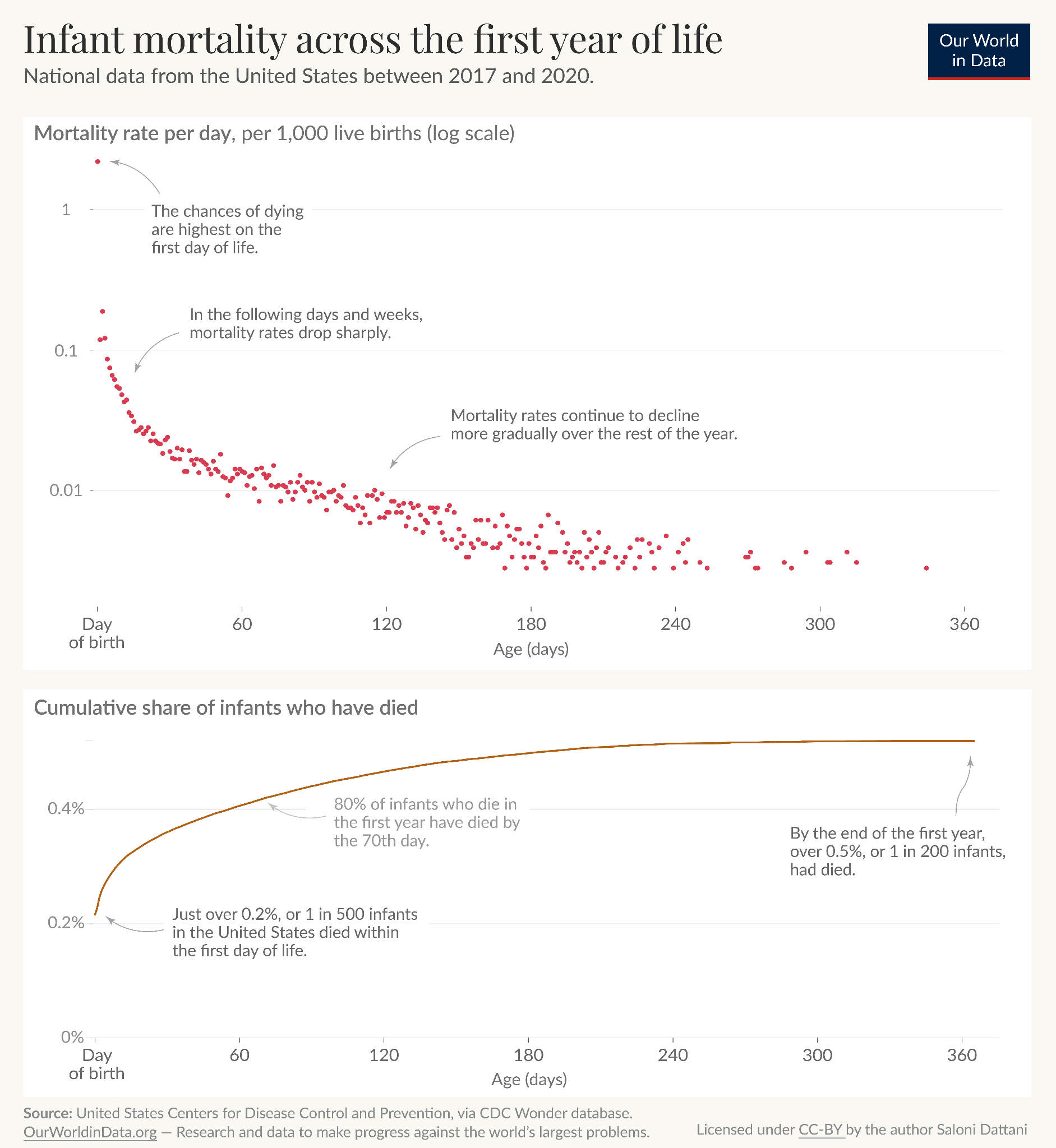
Take the example below, where I was interested in understanding the risks of infant mortality with age. One question I had was how the risks changed with age, which I’ve shown in the top panel. Another was how that accumulated – what share of infant deaths had happened by a certain time? I showed that in the second panel.
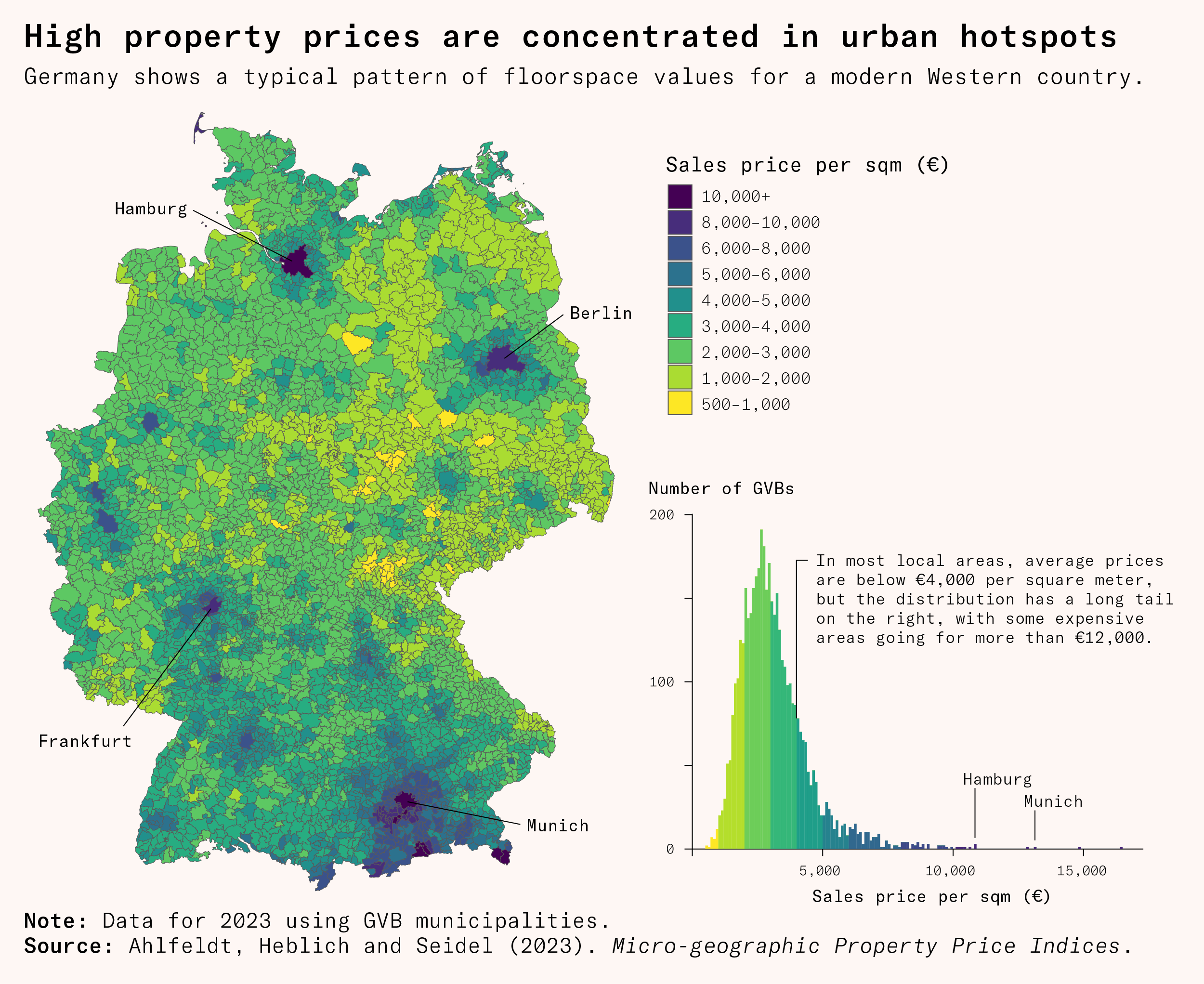
Here’s another example. This map of Germany shows property sales prices across the country, which is helpful to quickly spot areas with higher (or lower) property prices.
But a coloured map makes it hard to understand the distribution of prices; our brains aren’t great at mapping differences in colour to differences in number. So I added an extra histogram showing the distribution of property prices in municipalities.
Order categories logically or alphabetically
This is quite simple, but when you do have a legend, it’s helpful to order the categories with some familiar logic. If there is an inherent order in the categories, such as strongly agree, agree, disagree, and strongly disagree – don’t mix them up but sort them in ascending or descending order.
When there isn’t an inherent order, consider using alphabetical order, since this makes them easier to search or skim through.
Match colours to concepts when possible
People often have strong associations between colours and concepts. Plants are often green, meat is often red, bananas are often yellow. Also, red often means bad, and green or blue often mean good.
It’s easier to process a graph if the colours match familiar representations of those concepts. It’s harder if there’s a mismatch and the plant category is red, or the bad category is blue.
As my friend Ian says, we shouldn’t be running a Stroop test on people and doing the equivalent of asking them to read the word ‘blue’ when it’s in a red font.
Colour choices might also unintentionally make viewers think something is bad if it’s red, even if it’s actually neutral, for example. So it’s worth being thoughtful about them.
Make charts more colour-blind friendly
About 4 to 5% of the population has a form of colour blindness. To make sure they can also understand your charts, here are some suggestions:
Use an online simulator like Coblis to check your charts are clear and the categories can be distinguished
Consider a colour blind friendly palette
Label directly (I’ve heard from people with colourblindness that directly labelling helped them easily tell apart the categories)
Lisa Charlotte Muth has a great blogpost with additional points to consider when designing data visualization in a colour-blind friendly way.
Plain language helps readers focus on the data
It’s a shame how a lot of great visualizations reach a limited audience because they are not written in plain language.
My view on science communication is that most concepts can be understood by most people, if explained clearly, even if they don’t have years of expertise or training in a field. The bigger challenge is figuring out how to do it, particularly in a way that doesn’t involve cutting important/relevant information.
Here is an example by my former colleagues at Our World in Data of making a technical chart familiar and easy to understand for a wide audience.

The point is, we want to find a way to make things clearer without oversimplifying. If I had to guess, I’d say that experts also find lots of information easier to grasp when it is written in plain language. It’s generally easier to make connections between concepts, imagine the consequences of something, and also spot potential errors when reading familiar language.
… but sometimes jargon is important
There are exceptions: jargon is often important. If jargon refers to a specific category that you would like to distinguish from other similar categories, using plain language could confuse rather than clarify.
Consider these two examples:
The mean and the median might both be called the average in plain language (and people generally assume the average refers to the mean, even if you actually displayed the median).
Iron-deficiency anemia and anemia of chronic disease might both be called ‘anemia’ in plain language, despite having very different causes and implications for a medical audience. If the data refers to only one of them, it’s useful to clarify which one.
Here’s my recommendation in cases where distinguishing related concepts is important. Use the precise terminology, and if the chart is also useful for a wider audience, then include a brief definition or examples in plain language as well. For example, by saying ‘the average (median) value’.
Below you can see that I kept the phrase ‘external causes’ to match the official name for the category while also giving examples in plain language.
Consider guiding readers through a complicated chart
Sometimes the data you want to present can’t be presented well in a simple chart. A heatmap, a density plot, or a Lexis chart are all very valuable for communicating particular aspects of some data, but are unfamiliar to most readers and take time to read even for experts. That’s not always bad: it’s a trade-off you should think about.
A great suggestion I was given at Our World in Data was to annotate the chart directly to guide people through the visualization.
Below are two fairly complex chart types I’ve used in my work, with annotations to make them easier to follow.
The first is a heatmap on a Lexis plot – meaning the axes are age and year – and the colour refers to the death rate. There are therefore three dimensions on this chart, which in this case are very helpful to see that some events affected particular age groups at particular times, like HIV/AIDS.
But you need a little bit of an introduction to read this chart in the first place, which is why I’ve given a teeny tutorial of the chart in the first panel.
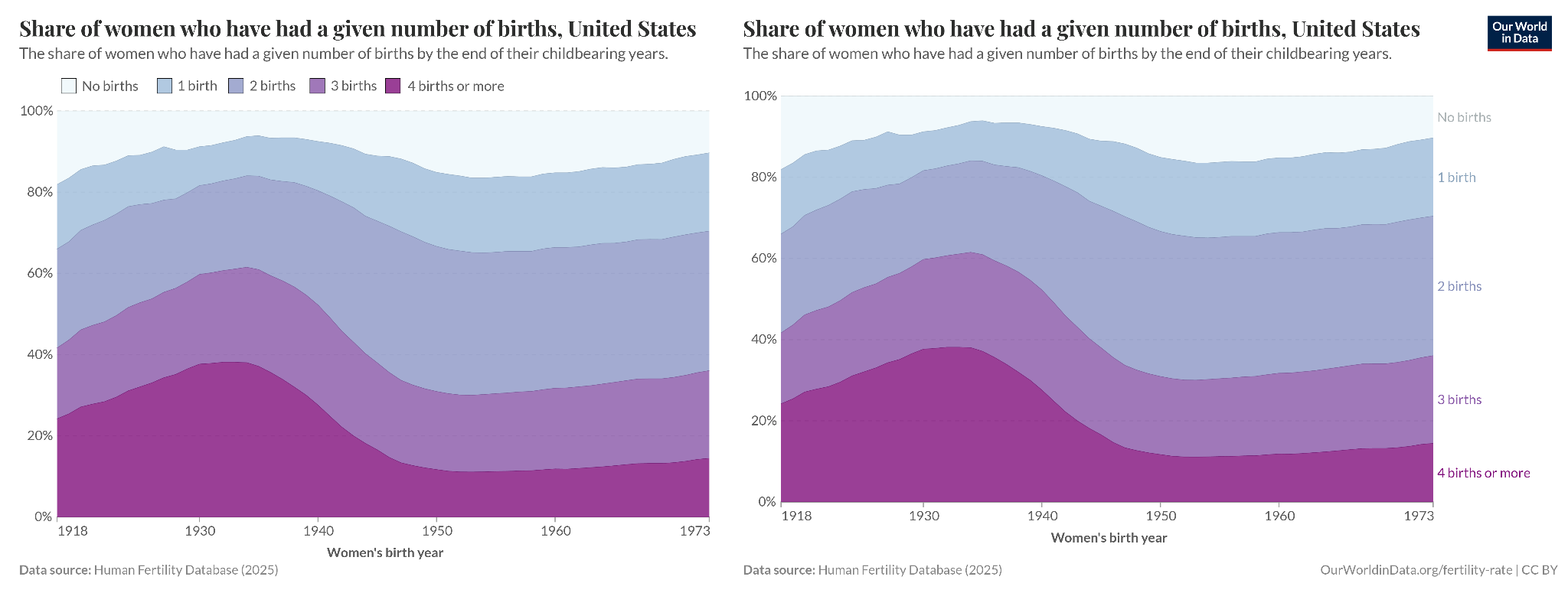
Here is another, which uses a ridgeline plot. Each curve represents a birth cohort (the data from all women born in a particular year), and the height of the curve refers to the number of children born to them at different ages. This ridgeline plot is helpful for seeing how generations of women differed in terms of the ages at which they had children, and in how many children they had.
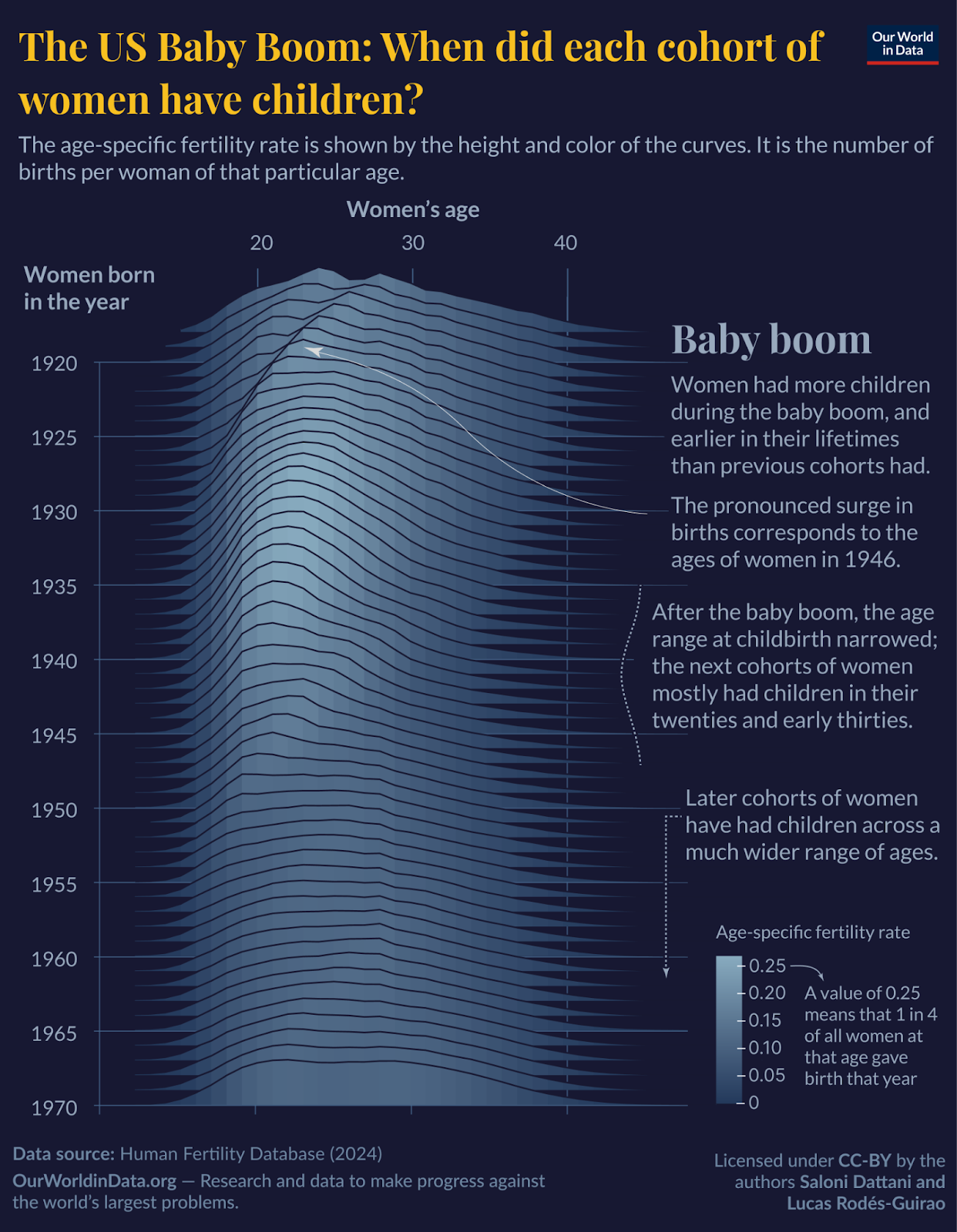
In this case, I thought it would take some time to get how the chart works, but it probably takes more effort to remember that while reading and know what to take away from it – so I’ve described the key points next to the chart, which you can read alongside it.
Make sure your chart works as a standalone
I have a strong opinion that charts should generally be clear on their own, without needing to read additional pages of text first.
Why? One reason is that charts are often reshared on their own, whether you like it or not, and lots of people will not link to the original source that contains additional context. So it’s best to include relevant context on the chart itself. Second, it helps actually read the data easily. I think it’s key to help readers focus on the data, rather than ask them to retain many pieces of information as they read a new chart.
Unfortunately, many academic charts are not very good at this. They often have a paragraph of text in a separate figure caption; sometimes the key details are spread across a whole page of text on a different page from the chart.
Many journalistic charts are not very good at it either, but for the opposite reason – they provide very little context at all. It’s harder to interpret a metric about mental health accurately if you haven’t said whether the numbers come from a survey or from diagnoses, for example. Giving key details, even briefly, can make it easier to interpret a metric accurately. Not giving them is like leaving out units on a chart; the different ways of measuring actually affect how one would interpret the data.
I like to think that we had an optimal balance at Our World in Data, with key information in the chart itself, and additional context in the subtitle or caption. It’s worth adding that the more important that context is, the more important it is to make that clear in prominent places, potentially rewriting the title with more precise language, even if that makes it less catchy.
Another organization that does this well, in my opinion, is Pew Research Center. In the example below, you can see their chart showing how the demographics of their survey respondents closely match benchmark figures in the population.
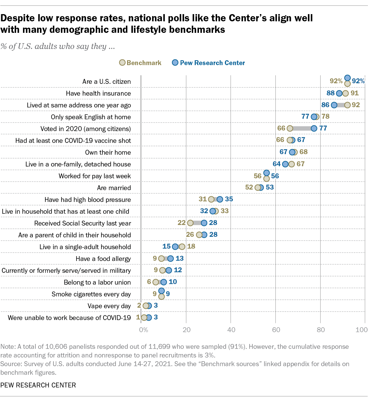
It’s also a nice chart for many other reasons – the title is a key takeaway, the subtitle is a concise and plain language summary of the metric, the chart is very easy to follow. The footnote gives useful information about how large the survey sample was and the survey’s response rate, and there’s a source line telling me when the survey took place. All of this is useful because the chart is telling me about the quality of survey data, and it’s not distracting.
Consider how your chart might be misinterpreted and think about making improvements
There are many ways that charts could be misinterpreted; I don’t think it’s possible to avoid all of them, and some people will misinterpret charts regardless. But occasionally, those misconceptions will be common, and I think it’s important for visualizers to try to pre-empt them.
One example I have seen is line charts with arrows instead of points.3 Unfortunately in this case it implies there is an underlying direction to the data and that the data will continue moving in that direction in the future.
Another mistake I fell for myself was accidentally colouring the land in light blue on a map (in the first map below). A few people said they were initially confused about why there was a United Kingdom-shaped lake on the map. That would indeed be very intriguing.
I could excuse myself by saying that a UK-shaped shape on a map is most likely representing a land mass, not a lake, but I can see how it would be mind-bending and confusing. Plus, it goes against the suggestion I gave before, on matching colours (like blue) to concepts (like the sea). On the right is how I’ve corrected it.
Zooming in too much or too little can both cause problems
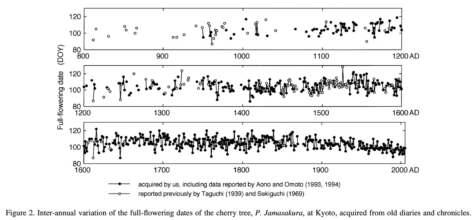
Many people will be familiar with the problem of the extremely zoomed-in y-axis. Take the example below, of the cherry blossom chart once again.
.png")
A common response is that you should stretch the axis to zero or show the full scale. So I’ve done that below. Is it better?

Well, now it’s misleading in a different way. Although the change was meaningful, you can’t see it at all here.
It’s helpful to think back to why the original chart seemed misleading. People will often say they thought it exaggerated the size of decline. I think that’s because the lowest point on a graph is perceived as the lowest possible value, since it often actually is.
There’s a trade-off between zooming out and not showing meaningful changes. There’s nothing intrinsically correct about displaying the full year – especially if it’s not actually relevant for cherry blossoming, and perhaps they wouldn’t flower at all if the climate changed substantially.
My view is that to strike a balance, it’s helpful to include a bunch of space above and below the maximum and minimum observed data, just so that people can tell the minimum observed point isn’t the minimum value possible, but not necessarily stretch the axis to zero. Here I’ve also changed the y-axis labels to more readable dates.
If your minimum observed data is already close to zero though, you might as well stretch the axis to include zero (or whatever the minimum possible value is, in your chart).

Metrics can be misinterpreted
Below is a chart I once worked on and never published. What is wrong with this chart?
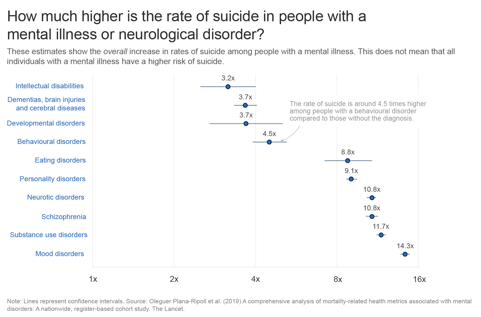
There are various things you may not like – like the labels being quite far away from the data points, or the log axis scale being confusing.
But there are two more problems. One is that the graph itself is often kind of alarming: seeing that the risks of suicide are so much higher with a diagnosed mental illness (even though the absolute risk may be low, and the vast majority of people diagnosed don’t die by suicide).
A related challenge is that people might think the risks are higher for almost everyone in that group. But the risk estimates describe the average effect for a diagnosed group. Averages can hide important differences: in this case, it’s unclear whether the risk is elevated to a similar degree for everyone in the group, or whether it’s much higher for some individuals but not for others.
This issue – distinguishing group averages from individual differences – reflects the ‘fundamental problem of causal inference’. This concept is about how we can observe only what actually happened to each person, but never the alternative outcome that would have occurred in a different condition, since we only see one version of history. So instead we generally estimate the ‘average effect’ across a group, and have to do additional research to find out whether the effect varies between people.4
A third, related challenge is that people interpret the lines as showing the range of increased risks. But as you’ll see from the footnote, they’re not ranges! They’re confidence intervals: a measure of how precisely we know where the average is, not a measure of the variability of outcomes.
One idea is to write a clearer subtitle or add notes on the chart to explain that this is an average effect, the ranges are confidence intervals, and that the increase in risks likely vary a lot between people.
But even labelling confidence intervals doesn’t help much: people tend to perceive them as a depiction of variability on a visualization, as a very interesting experimental paper recently demonstrated, and as a result, people think that the range of data points is narrower than it really is.
So what is the solution? How do we make the range of data clearer?
An option the authors suggest is to display ‘prediction intervals’ instead of ‘confidence intervals’. In prediction intervals, the interval reflects how much individual outcomes vary (using the standard deviation). In confidence intervals, the interval reflects how uncertain we are about the average effect (using the standard error).
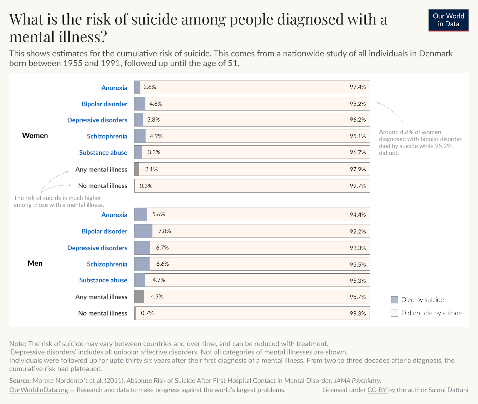
In practice, this would require individual-level data so that I could calculate the standard deviation of the outcomes. Since I don’t have that, another feasible alternative is simply to show the underlying percentages, which makes clear that the risks are higher and also shows what those risks actually are, in numbers that are familiar.
The choice whether to use this graph instead of the other also depends on the audience and, like the y-axis problem, it could conceal meaningful differences.
Risk ratios, although they’re easy to misinterpret, can still give meaningful information about how strongly a treatment or condition is associated with an outcome within comparable subgroups. They help highlight relative differences that might be important for understanding patterns, even if they don’t clearly tell us how big the actual risks are or how much those risks vary from person to person. If you do use them, you should be careful about how you communicate them.
Try to avoid optical illusions
Below is an illusion that was new to me.
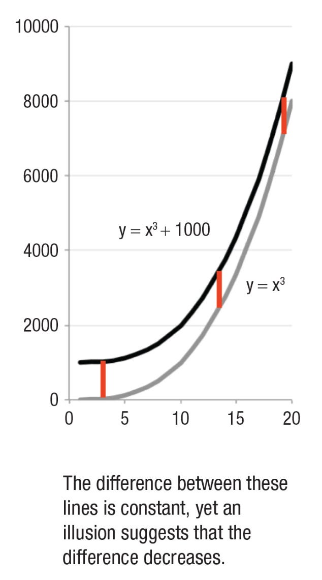
The curved lines are becoming steeper on a linear scale, and it looks like the difference between them is narrowing even though the difference is actually constant. I suspect this is because I’m thinking about the closest distance between the two lines (something like the horizontal difference) rather than the vertical difference at a given point along the x-axis.
I found this illusion in a review paper called ‘The Science of Visual Data Communication: What Works’, which I highly recommend for many other tips. The authors suggest that when it is important to communicate the difference between two lines, then it’s more useful to plot the actual differences (A-B).
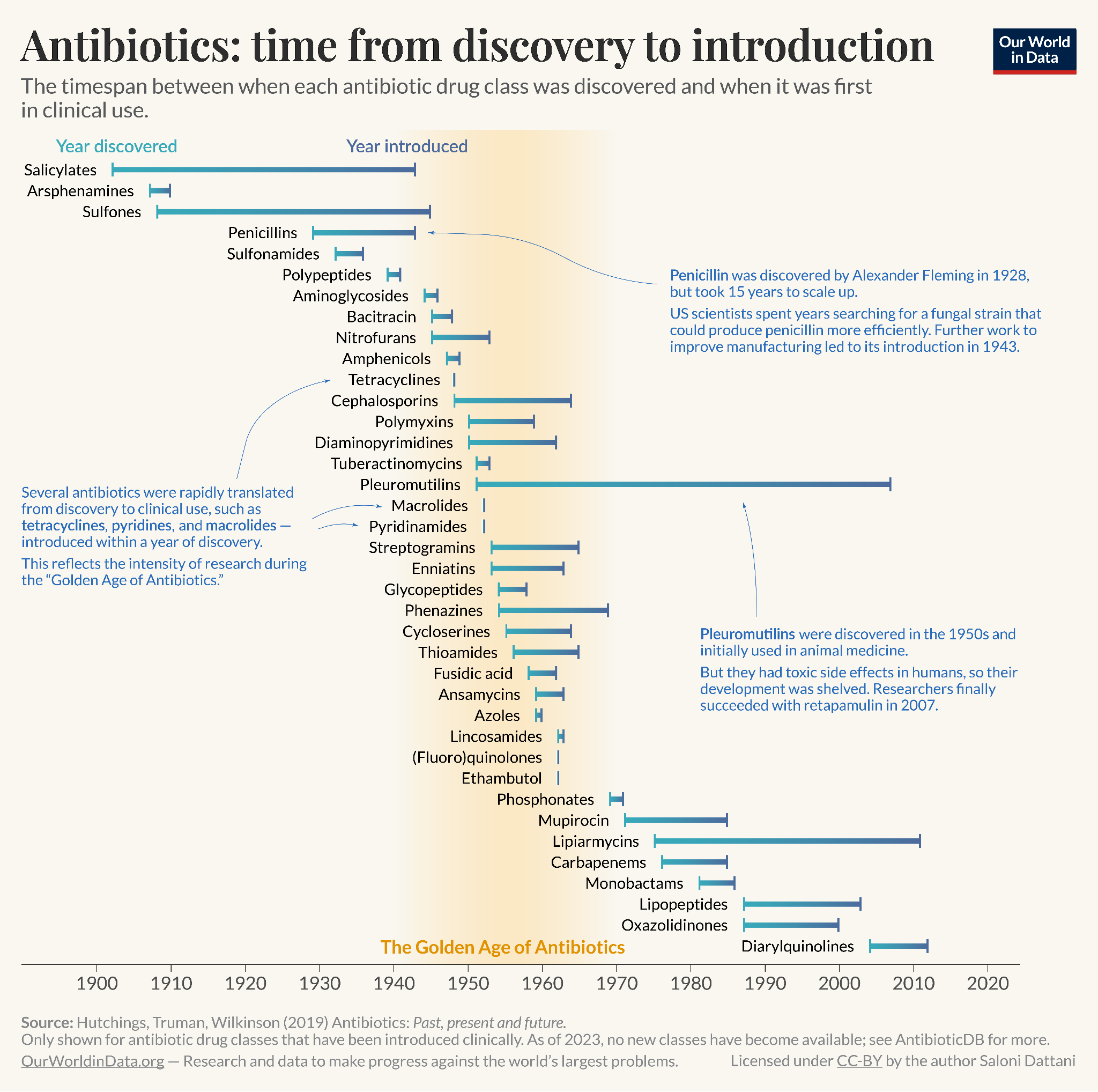
One way I like to plot differences is with a range plot, which helps highlight a difference while also showing the starting point and the ending point.
This range chart I made highlights the time it took between an antibiotic class being discovered to when it was first in clinical use. Penicillins, for example, took 15 years to scale up into sufficient quantities to be used widely. Some other antibiotic drug classes took even longer: over 50 years for pleuromutilins. In contrast, many antibiotics discovered during the ‘Golden Age of antibiotics’ (1940s–1960s) were rapidly translated from discovery to clinical use.
Make charts more transparent
A chart with no source isn’t much better than claiming a trend was revealed to you in a dream. But seriously, it should be possible for people to find out where the numbers in your chart come from. Transparency would ideally help people have a better sense of the credibility of the data, read about the methods, verify the data, and reuse or adapt the chart.
At minimum, I think people should list the source of the data on the chart, with footnotes that clarify details for a more interested reader. But I have a bigger dream for transparency in data visualization.
Maximally reproducible charts
My dream is that one day, every chart will have a button you can click that will open up the data behind the chart, metadata, an explanation of what was measured, and the code to recreate the chart – which you can instantly run to reproduce the chart you saw.
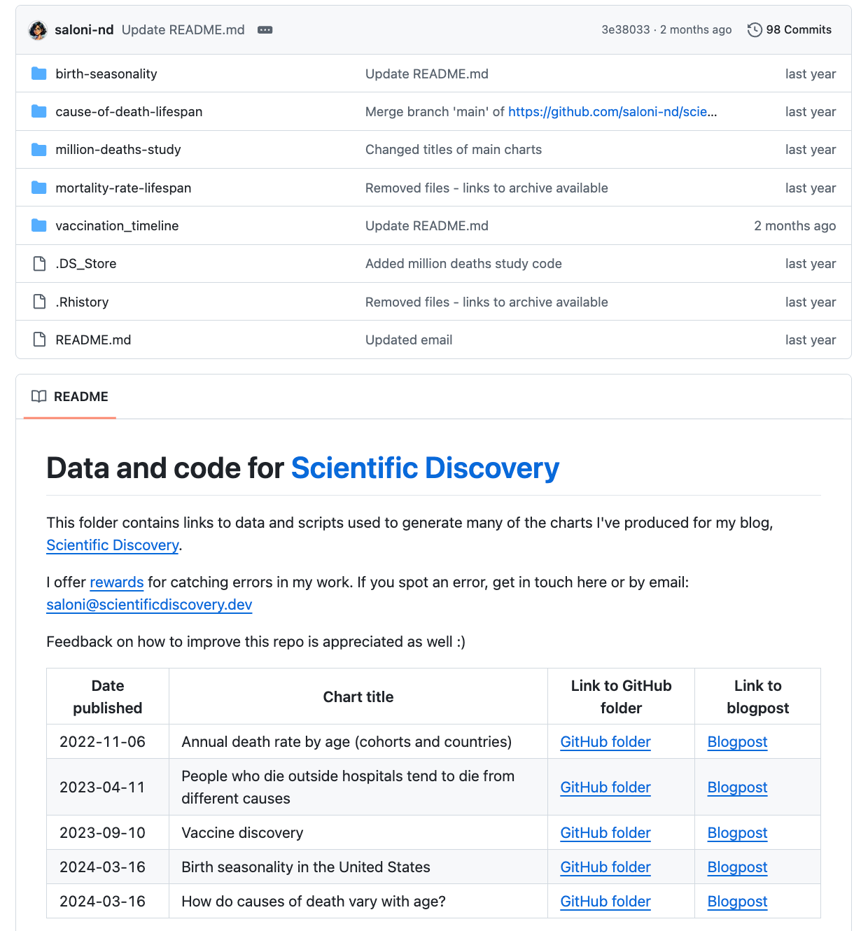
Sadly I don’t know how to make that happen and I’m quite busy with other work, so my current best alternative is to include a link on my charts: code.scientificdiscovery.dev (as you can see below) which takes you to my GitHub repository for this newsletter.
There, you can find a folder with each chart, the data, an explanation, and the code to reproduce it. [You can also find the code for charts I’ve made for this newsletter on the ‘Code’ tab at the top of my newsletter. For the charts I produced at Our World in Data, find the code here.]
Transparency is important; there’s a possibility that I have coding errors in my work, even though I’ve looked through it a few times. I’ve set up a ‘bug bounty’ scheme to reward people for finding errors in my work and telling me about them.
Sadly there have been few takers yet, although I don’t think this is because the errors are absent – I occasionally spot them myself. I’ve considered paying someone to go through and check it all, but in any case, I’d still think it was helpful to keep things open source as more people read my posts (and more people could potentially spot errors), and because people are occasionally interested in reproducing charts or adapting them for their own purposes.
That’s another reason I’ve found to share the data and code behind your charts: I personally really enjoy when people explore data I’m interested in further and create new visualizations with it, which I get to learn from.
Conclusion
When I did data visualization during my PhD, I received no training in it. I think it’s a skill that’s often seen as a nice bonus, or simply difficult to do well and better left to other professionals.
I hope I’ve convinced you of the opposite. Data visualization matters, and it has a lot of value beyond textual descriptions. Charts can be more memorable, shareable, and quickly understood than a written explanation. You might have even scrolled past most of my text and only focused on the headings and charts themselves, and that would be fine. Sort of. Well, if you did, you might have missed some important points I made and taken the wrong messages from them and that would annoy me a little bit.
But all this shows how impactful data visualization can be, how it can influence people’s interpretation, and that it takes responsibility to get that right. Getting there is not a mystery.
There are lots of resources you can find online, and tools like Datawrapper to make charts quickly. Most importantly, you can follow my guiding questions to help improve your visualizations:
Is my chart type meaningful?
Can I make it clearer?
If my chart is too complicated, can I guide the viewer through it?
Does the chart work as a standalone, as far as possible?
Is my chart’s presentation justifiable?
Is my chart reproducible?
If you’d like, use this post as a reference when making your own visualizations. There are some general principles that many people will agree with, but I’ve also explained that many choices come with trade-offs. Your decisions ultimately depend on what you’re actually trying to communicate, and that’s what should be front and centre when you’re working on a new visualization.
And, if it’s too difficult to make a choice, you could show multiple perspectives in the same chart. The tyranny of choice can often be solved by simply choosing both.
Go ahead and make some beautiful charts!
Further reading
If you’re interested in more, or I didn’t answer a specific question you had, here are some of my recommended readings for more guidance on data visualization:
Datawrapper’s blog series on Do’s and Don’ts in data visualization [blog series]
A great review of the research on data visualization: ‘The Science of Visual Data Communication: What Works’ by Steven L. Franconeri, Lace M. Padilla, Priti Shah, Jeffrey M. Zacks, and Jessica Hullman [academic review]
Data visualization: a practical introduction by Kieran Healy [walkthrough book using R]
Which tools do I use?
People often ask me which tools I use to create data visualizations. My workflow involves several tools; some are skippable, depending on how much time you have and what you’re trying to achieve.
Here’s my typical workflow for a chart:
I download the data and write up code in R, using ggplot2 to create a graph
I then export the graph as an .svg file, and open it up on Adobe Illustrator or Figma5 to make additional tweaks, such as adding annotations on top of the chart
For a standard type of chart – like a bar chart, a choropleth map, a line or bubble chart – I instead use Datawrapper to create interactive charts very quickly. They follow great data visualization principles, have influenced my work, and their styles look great. (Plus, most of the features are free if you make an account. I have a subscription to Datawrapper through Works in Progress, which allows us to use a customized theme.)
Datawrapper has probably improved the quality of data visualization in the media. I rarely see 90º rotated text on charts or ugly legends or distorted scales in mainstream publications anymore, and it’s partly because they’re relying on Datawrapper, which has some strong (and great) default settings.
A few personal updates
As always, I hope you enjoyed reading this. If you haven’t already, I hope you subscribe and share it with your friends! If this is your first time reading, I recommend checking out the About page.
It’s been a while since I posted, so here are some personal updates in case you missed them:
In August, I left my role at Our World in Data and joined Works in Progress full time! I’ll now be editing more pieces, writing more long-form articles on all things science, health and medicine, and hosting the podcast Hard Drugs on medical innovation with my friend Jacob Trefethen.
On the Hard Drugs podcast, we’ve released episodes on: Lenacapavir – the miracle drug that could end AIDS, the history of insulin, the history of vaccines, and on whether AI will solve medicine. You can listen wherever you get your podcasts, read the transcripts, or watch on YouTube.
Since August I’m also a volunteer advisor at Coefficient Giving (previously Open Philanthropy) on clinical trial reform, working with Matt Clancy and Jordan Dworkin, which I’m very happy about. Here’s a longer tweet about my change in roles.
Scientific Discovery is now a Works in Progress publication! This will give me more time to write posts regularly, and I’ve also rebranded the design of this newsletter, as you can see on the welcome page and the new logo.
See you next time! :)
– Saloni
Corrected 11 Dec 2025: This originally said ‘Unless you are living in 19th century Japan…’, which sounded funny to me, but was untrue, since vertical text is still fairly common in Japan and Taiwan, and is the dominant writing style in Mongolia, so I corrected it. Thanks to Yun-Fei Liu for pointing this out.
I also made other minor improvements to grammar throughout this post after publishing.
It’s worth considering whether horizontal bars are worthwhile. If the height is meaningful – for example, the data refers to height itself, or the data is often viewed vertically – then you should probably keep the bars vertical too. A lot of people look at charts on their phones, with vertical aspect ratios, so it’s often better to keep the chart itself vertical, and have the text horizontal.
John Burn-Murdoch of course has many other fantastic visualizations.
In a repeated crossover trial, the problem is much less severe because each person receives both treatments repeatedly, and by repeatedly observing each individual under both conditions, researchers can average over natural fluctuations to approximate the missing counterfactual. But the problem still isn’t fully resolved, since the two potential outcomes never occur at the same time and period effects can still distort individual comparisons.
You can also use tools like PowerPoint or Preview for simple changes, but they have a lot fewer features and are fiddlier to use.
Superb article. I have not seen anything this good since my three books by Tufte were stollen by another consultant.
Amazing article! I'm showing this to my lab colleagues. We might even start a small journal club to hone our data visualization skills.
This isn’t related to your bug bounty, but I did want to point out a factual issue in the post. You wrote: “Unless you are living in 19th-century Japan, you are probably used to reading text horizontally.” This is not quite accurate. I can’t speak for all East or Southeast Asian countries, but readers in China, Japan, and Taiwan are still very familiar with vertical text.
Even today, vertical writing remains common in Japan and Taiwan, where many books are published in vertical layout. In China, modern books are almost always horizontal, but vertical text is still widely used for store signs, poetry, and calligraphy.
Because logosyllabic writing systems (e.g., kanji/Chinese characters) allow characters to stack upright without rotating them, vertical writing is very natural to read. This also avoids many of the orientation issues that arise when rotating horizontally written text in data visualization contexts.